Digital Screen Interaction Improvement
Category:
UX Design
Client:
MSU Libraries
Duration:
1.5 Months
The Challenge
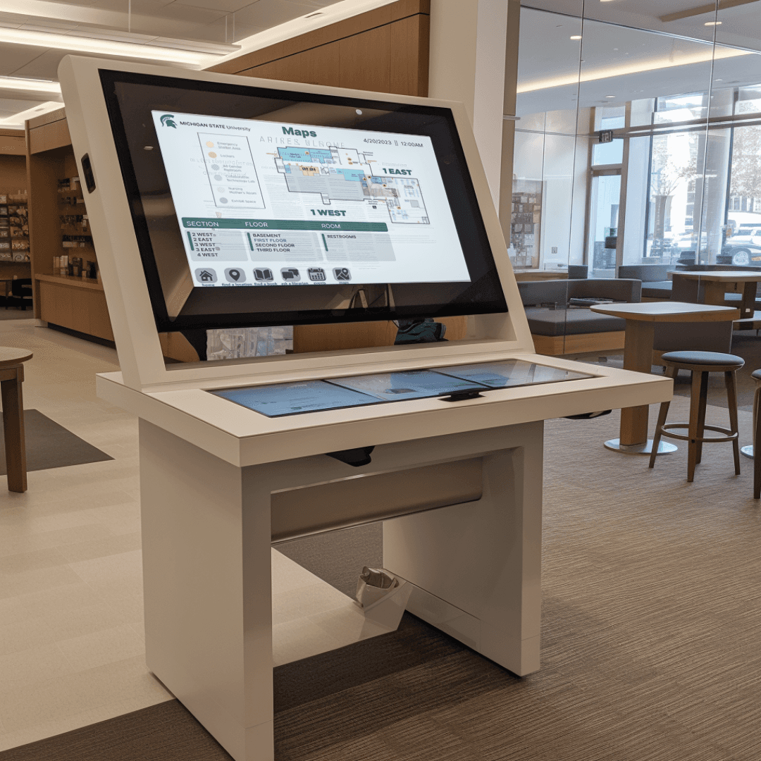
The goal was to allow for obvious indication of easy usage of interactive signs which are scattered around the MSU Main Library
Responsive
Design a screen that prompts users to interact with
Develop
Create interactive and helpful experience
Constraints
My Role
My role in a team of 5 was to participate in user surveying and creating high fidelity mock-ups
Defining Project Goals
ooooooooo
Create an easy to use and accessible platform
ooooo
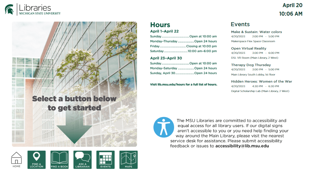
Create a welcoming home screen that invites users to use the screens
oooooooooooo
Establish WCAG 2.1 standards for accessibility
oooooooooo
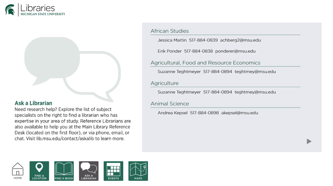
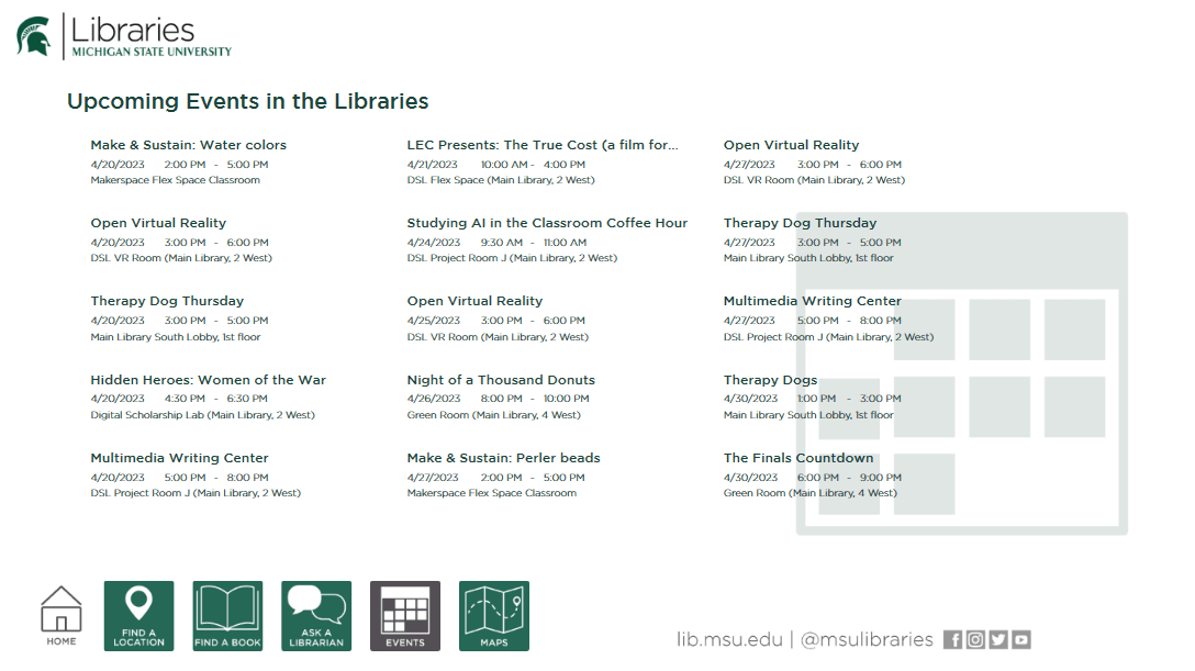
Design an easy-to-use experience for all library needs
Original Site
The Process
Key Takeaways
One obvious takeaway was lack of accessibility of a multilingual website. This was highlighted in my managers' concerns and later echoed in initial user testing
Wants from Translation Center
Aesthetic
More visual appeal, make a good first impression, create a positive brand image, and to increase conversation.
Accessibility
The current site does not offer translations or any accommodations to any imparities which is especially crutial to this type of work
Review of Discipline standards
To create a design consistent with the expectations of the websites target audience, I analyzed websites associated with Michigan State University that would match the audience

Defining Deliverables
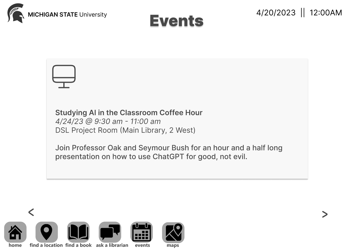
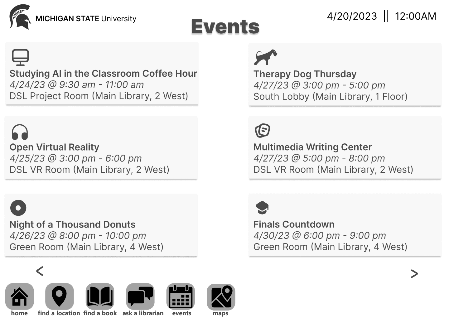
Mid-Fidelity Wireframes
Based off of research and meetings with managers, i curated wireframes with the current goal in mind:
Testing to Improve
Key Findings
All participants were able to compete user tasks flows
Issue 01
After reading the home page 3/5 users took a minute to find the request a translation area
Issue 02
Users were unsure where to find pricing for translation services
Issue 03
2/5 users attempted to navigate to translation request when viewing translation services
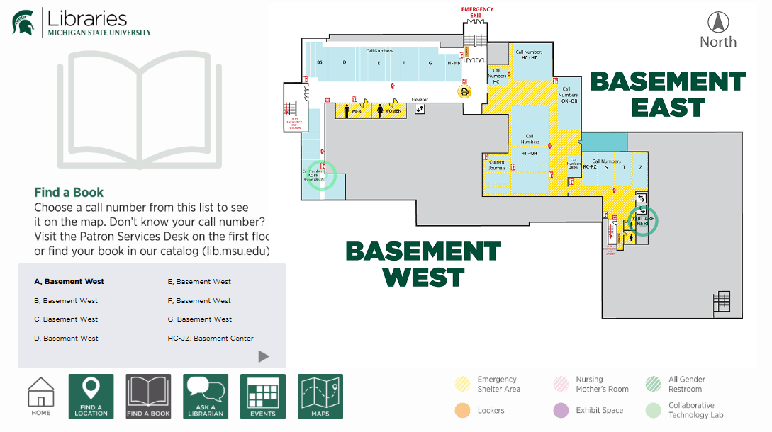
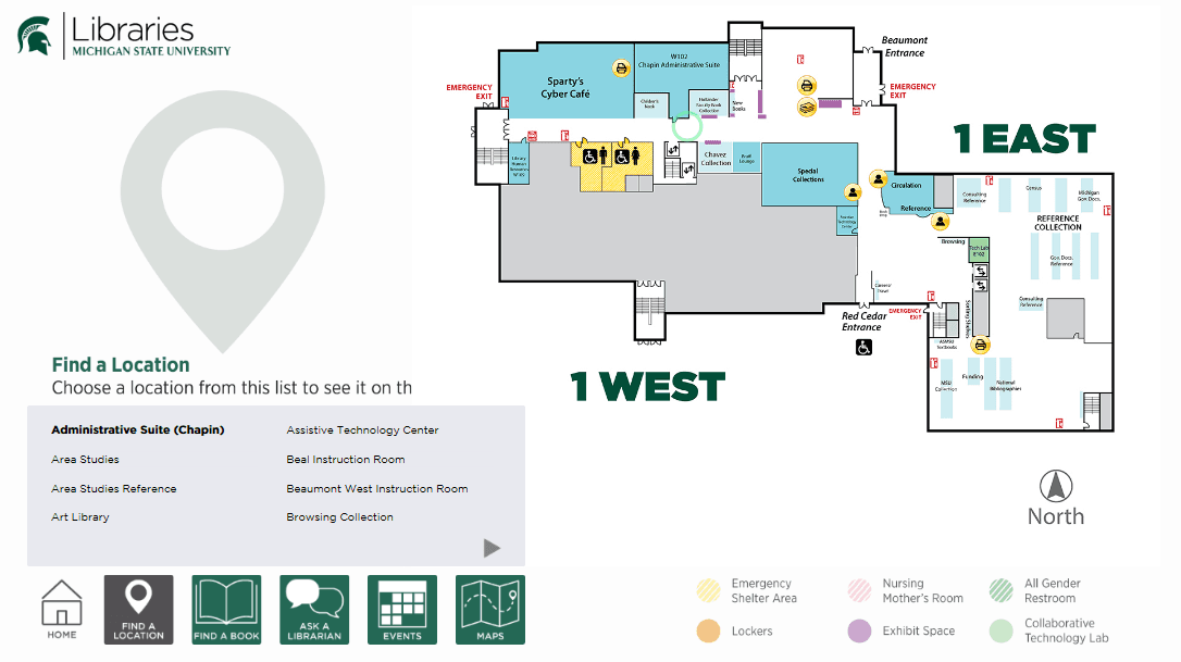
High-Fidelity Mockup Designs
What I learned
Think about EVERYTHING
The research process for this case study involved a variety of methods, including user surveys, interviews, and usability testing. This allowed me to gather a comprehensive understanding of the user experience and identify areas where the interactive signs could be improved.
Design will never be perfect
One of the most valuable lessons I learned was the importance of involving users in the research process. By getting feedback from library users, I was able to gain a deeper understanding of their needs and wants. This information was essential for generating meaningful improvements to the interactive signs.
Get creative!
Another important lesson I learned is the importance of usability testing. Usability testing allowed me to identify and fix usability problems before the interactive signs were launched. This helped to ensure that the signs were easy to use and met the needs of library users.

